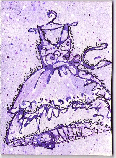
Variations of the theme I started with the blue crows. I changed the text follow the curve of the object instead of accross the card. Trying to decide which way I like it better (blue crows is in my gallery)...which way do you like it better?
This site uses cookies to help personalise content, tailor your experience and to keep you logged in if you register.
By continuing to use this site, you are consenting to our use of cookies.