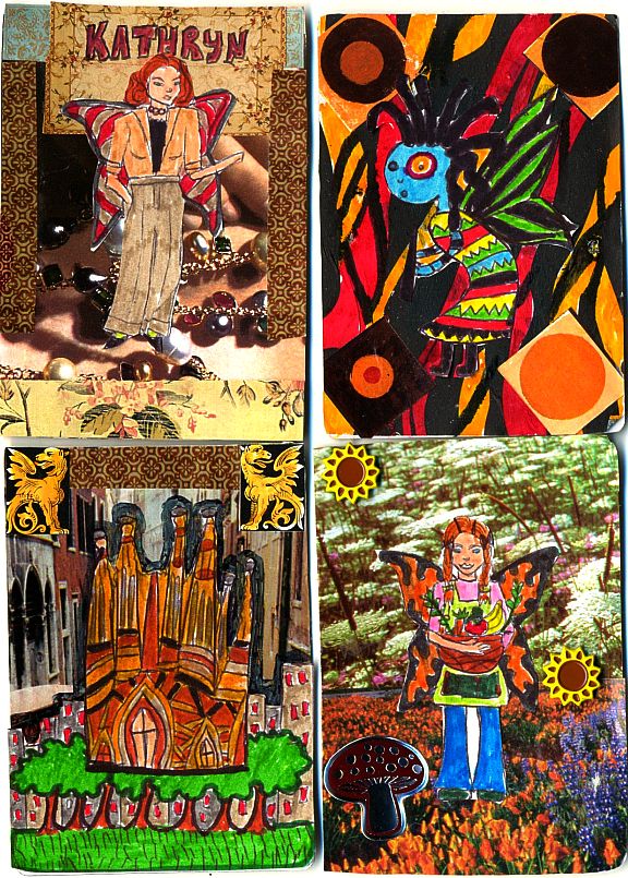
Nifty cards! My only critique of these is that the colours are too saturated and too busy. This makes the picture look cluttered and makes it hard to see the detail. I recommend that you do not put hand drawn images atop busy photographs without subduing the background colour a bit. Maybe a semi-opaque piece of paper like tracing paper might help this? Either that or choose "Softer" backgrounds.
This site uses cookies to help personalise content, tailor your experience and to keep you logged in if you register.
By continuing to use this site, you are consenting to our use of cookies.